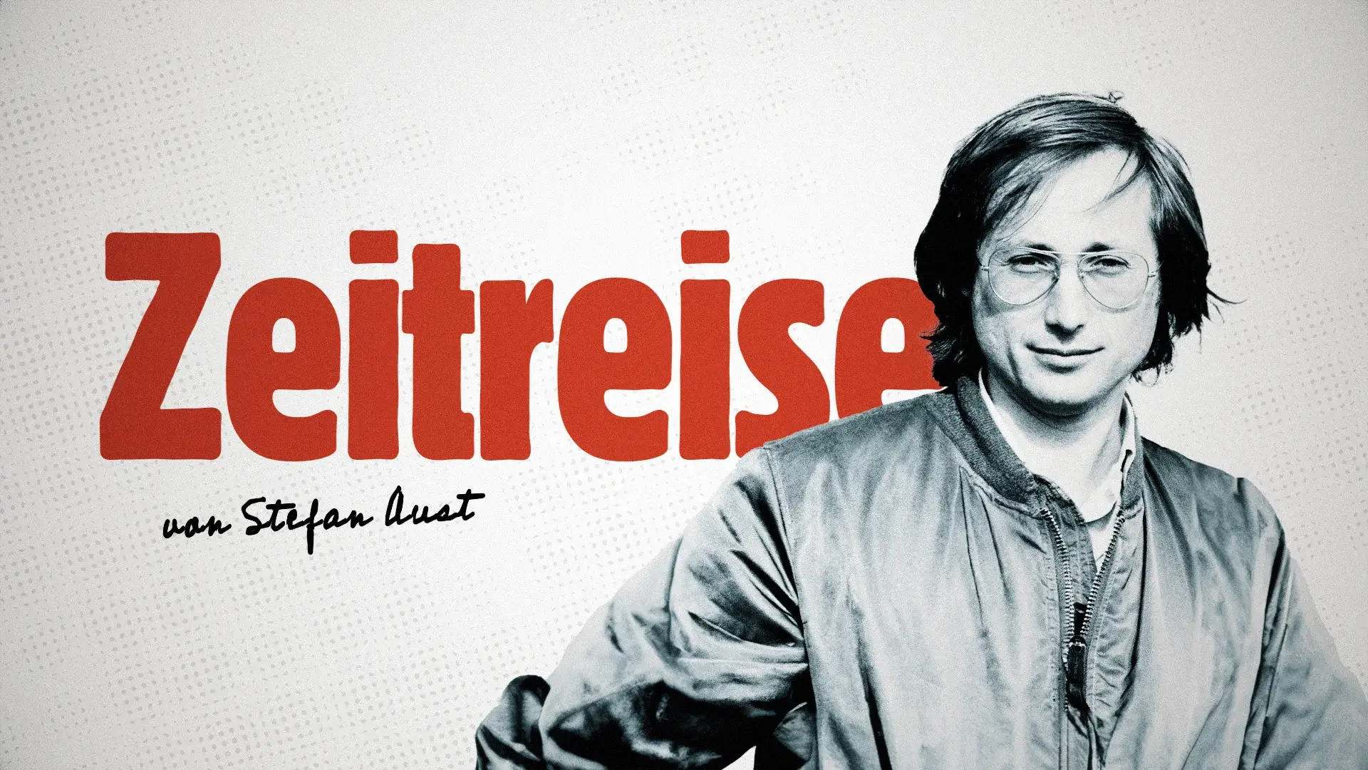
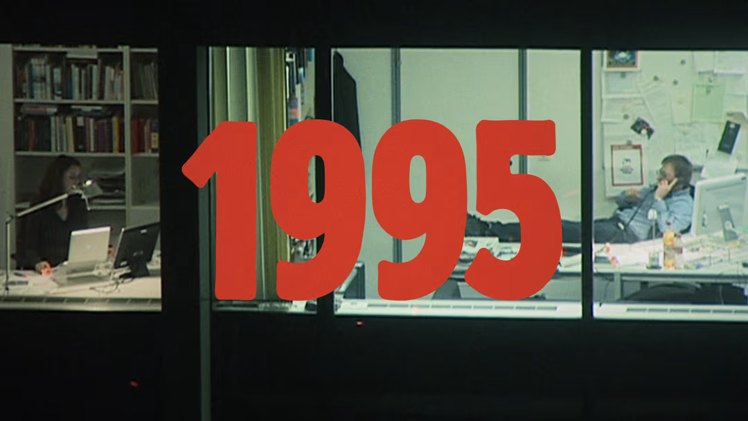
Zeitreise
Show Design for a German History Documentation Series
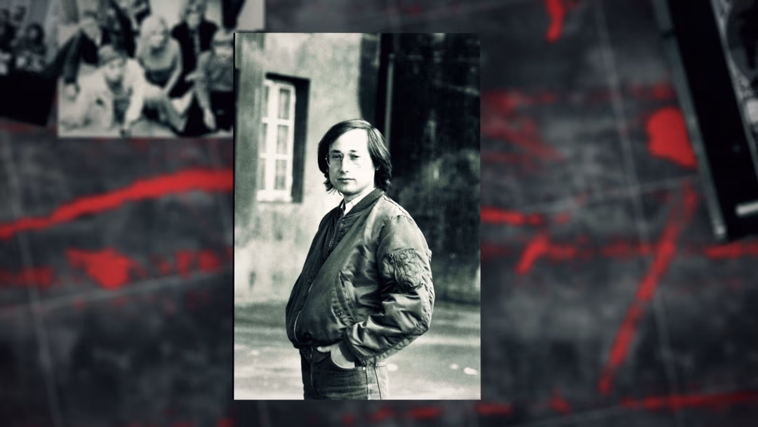
Designing for a history format that feels fast, fresh and not like a museum tour? Yes, please. When the production company asked me to take on the show’s visual identity, I knew this would be something fun to dig into.

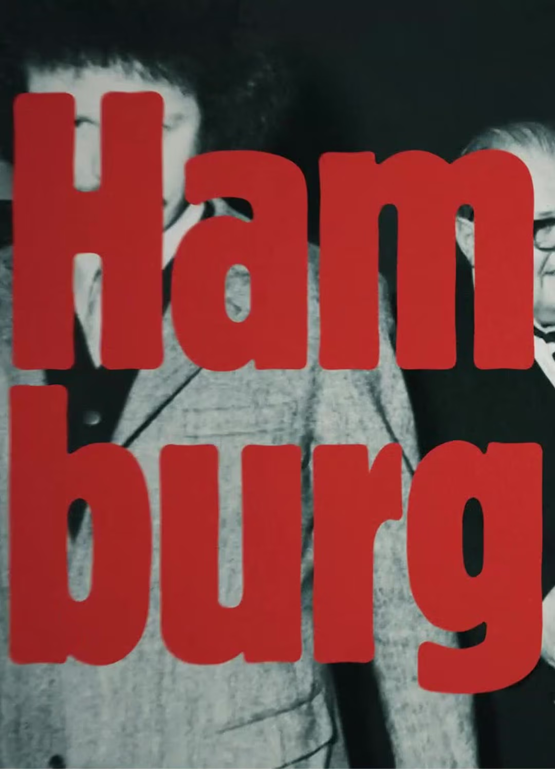
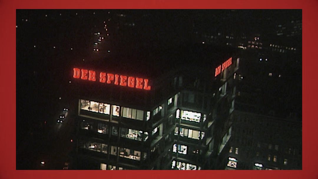
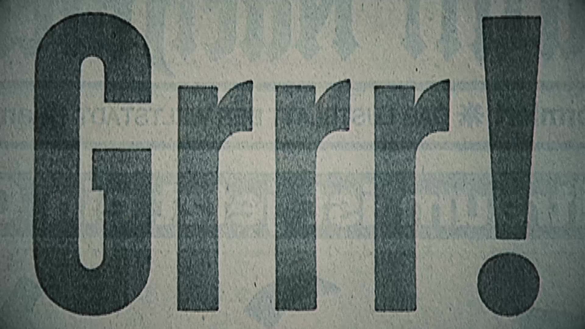
The first idea came from the reference book and "Der Bader-Meinhof-Komplex", paired with those gritty 90s Spiegel TV graphics. Rough textures, Helvetica, punchy cuts – that raw, documentary feel was the core vibe I wanted to channel.
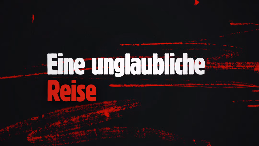
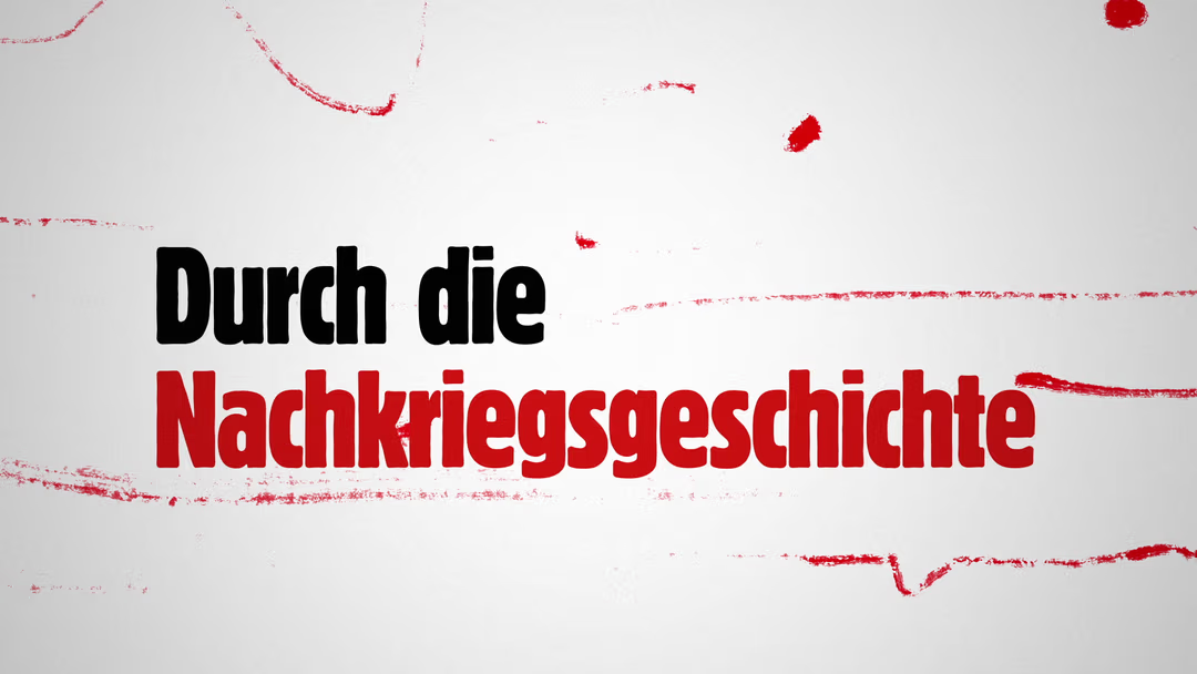
The color palette leans into black and white images and warm rust tones – like old film footage that’s been sitting on a shelf a little too long. There’s nostalgia, but also a sharp digital clarity that keeps it grounded in the now.
Rust-Red
#CD412D
205,65,45
Off-White
#F5F5F5
245,245,245
Charcoal
#121212
18,18,18
Rust-Red
#CD412D
205,65,45
Off-White
#F5F5F5
245,245,245
Charcoal
#121212
18,18,18
For the typeface, I chose Berthold Block – bold, boxy, full of character. It screams “headline” in the best way. And whether it’s in the opener, lower thirds, or on the site, it holds its ground.