Brand Identity and UX/UI for Rechtsklarheit
From visual identity to a responsive website and CMS
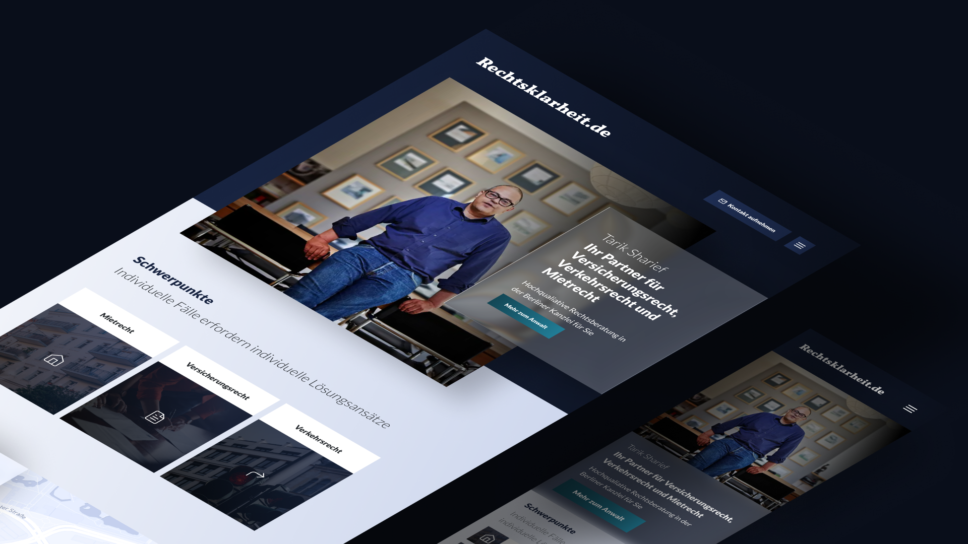
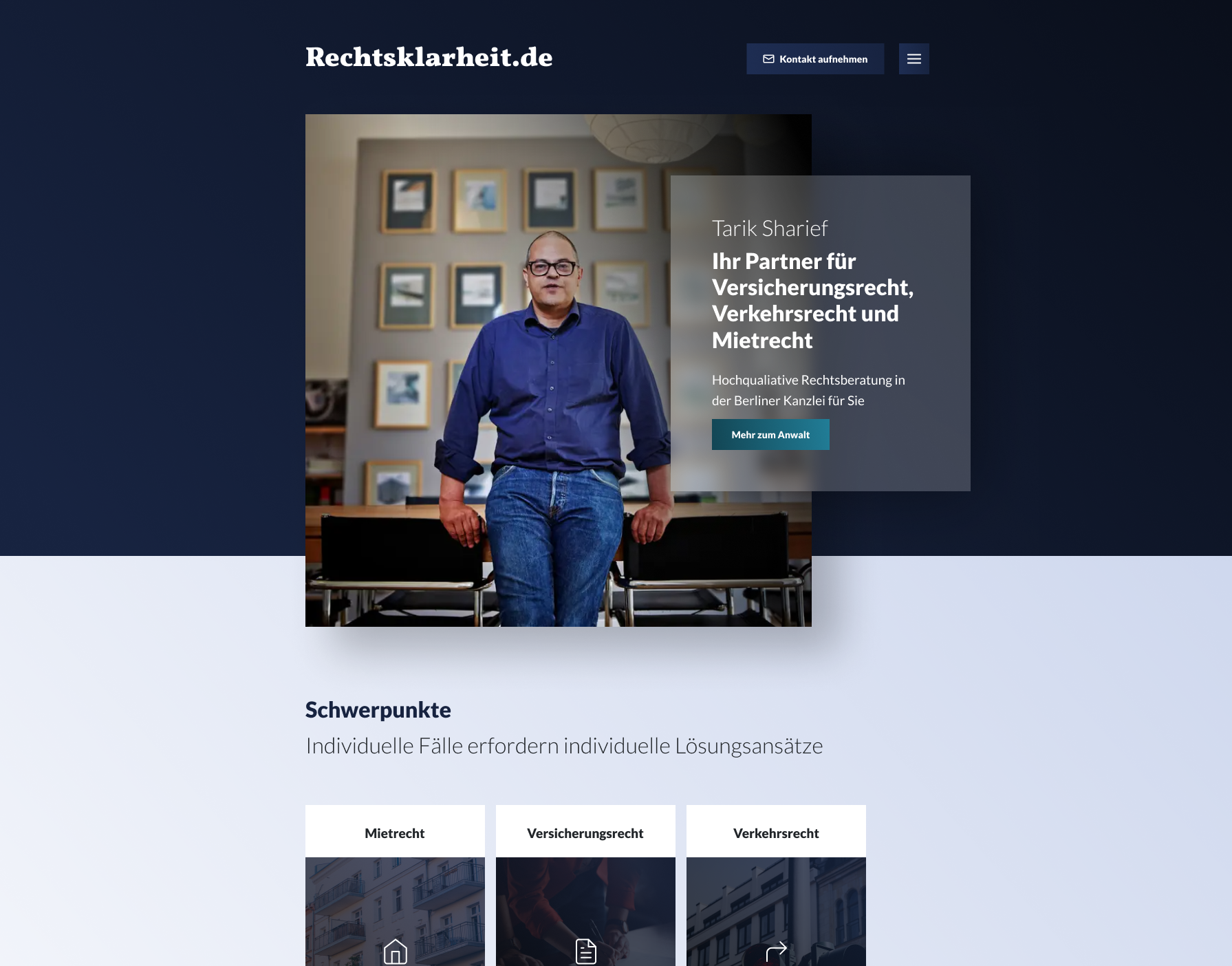
For Berlin law firm Rechtsklarheit and lawyer Tarik Sharief, I worked across brand identity, UX/UI design, and frontend development. The project connected the firm’s visual identity with a responsive website that presents legal services clearly and gives the team a way to maintain its own content.
The design work and implementation informed each other: typography, color, and page structure became reusable patterns for service pages, legal content, and blog posts.
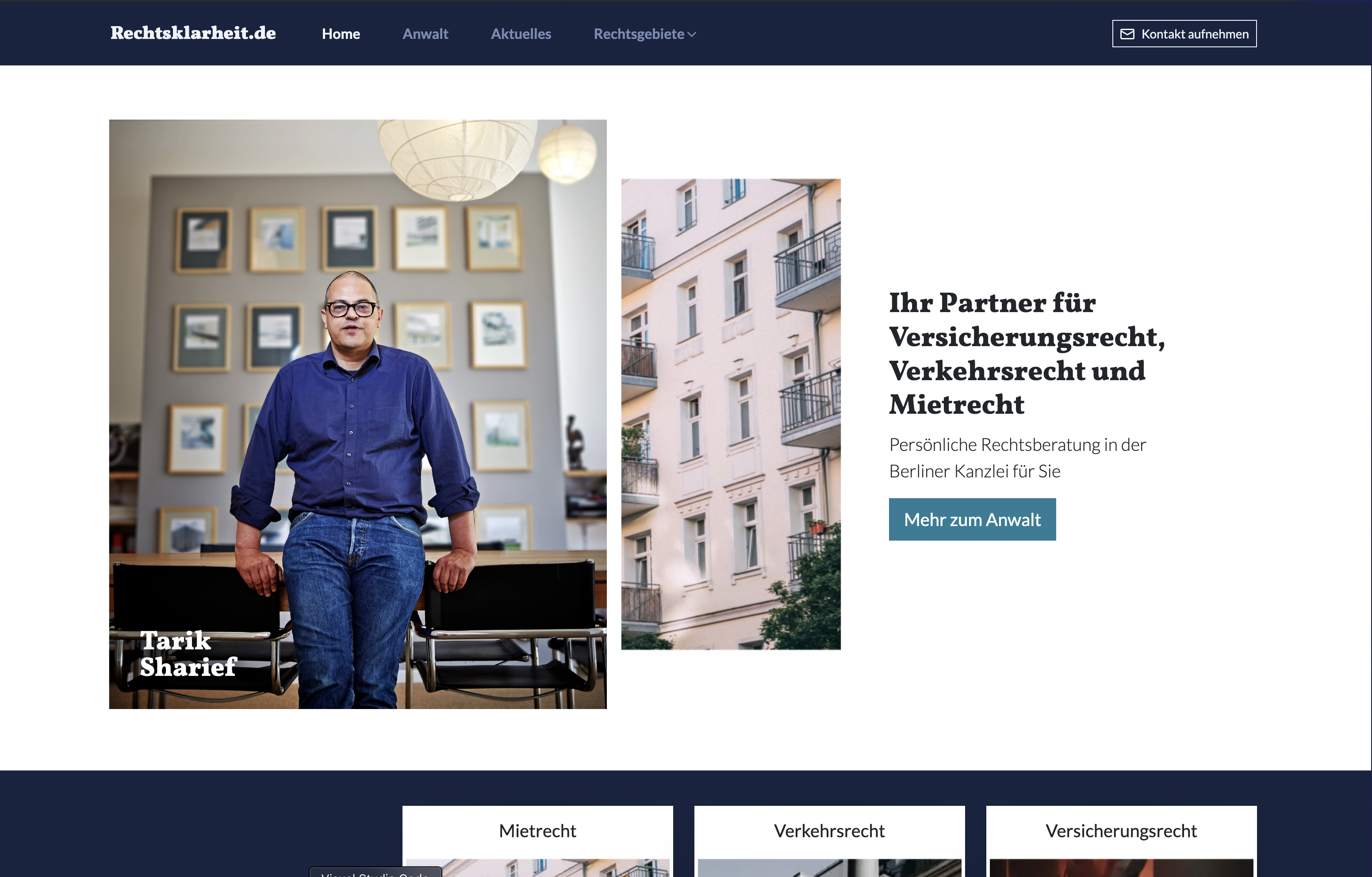
A connected process from brand identity and interface design to a working website.
The website brings together practice areas, legal information, blog posts, and contact options. I used a modular page structure to keep these different content types visually related while giving each enough space for its own information.
On mobile, readable text and a clear hierarchy were central to the UI. The same layout patterns carry through the site, helping visitors find their bearings as they move between service pages and articles.
Deep blue and turquoise form the core of the visual identity, paired with a logo designed for use across formats. On the website, the colors help distinguish headings, links, and accents. Typography and spacing give long legal texts a readable hierarchy on desktop and mobile.
Dark-Blue
Primary
RGB 23, 35, 64
Derived preview, not documented project tokens.
#E8E9EC
#B9BDC6
#8B91A0
#515A70
#172340
#121C33
#0E1526
#090E1A
#05070D
Cyan-Blue
Secondary
RGB 37, 142, 166
Derived preview, not documented project tokens.
#E9F4F6
#BEDDE4
#92C7D3
#5CAABC
#258EA6
#1E7285
#165564
#0F3942
#071C21
Light-Blue
Highlight
RGB 51, 69, 124
Derived preview, not documented project tokens.
#EBECF2
#C2C7D8
#99A2BE
#66749D
#33457C
#293763
#1F294A
#141C32
#0A0E19
Paper
Fond/Background
RGB 233, 236, 246
Derived preview, not documented project tokens.
#FDFDFE
#F8F9FC
#F4F6FB
#EFF1F8
#E9ECF6
#BABDC5
#8C8E94
#5D5E62
#2F2F31
White
RGB 255, 255, 255
Derived preview, not documented project tokens.
#FFFFFF
#FFFFFF
#FFFFFF
#FFFFFF
#FFFFFF
#CCCCCC
#999999
#666666
#333333
Text on base colors
Contrast for black and white text. AA for normal text requires at least 4.5:1.
The interface uses shared layouts for service pages, legal content, and blog posts. Consistent headings, content sections, and contact options let visitors move between different subjects without having to learn a new page structure.
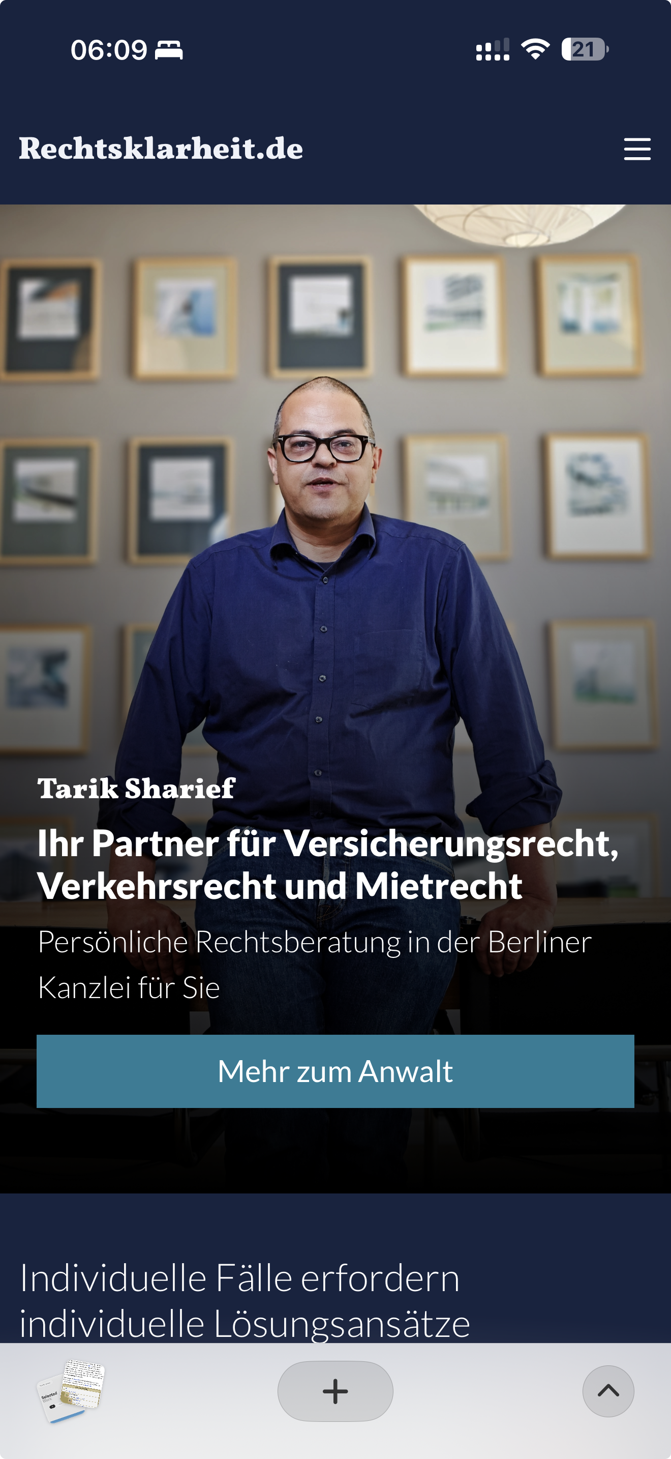
These patterns connect the brand to everyday use: reading about a legal service, browsing an article, or finding a way to contact the firm. Reusable layouts also support additional topics and content over time.
I implemented the website with Gatsby and React, translating the interface into reusable components for legal content, services, and blog posts.
Netlify handles hosting and deployments from Git, while Decap CMS gives the team an editing interface for maintaining content.
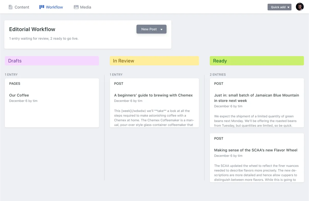
Behind the scenes, Decap CMS empowers the firm’s team to manage their own content without touching code.
- 01Blog posts, service pages, and updates can be added through a simple UI.
- 02The CMS writes directly to the Git repository, keeping the workflow consistent and version-controlled.
- 03Editors enjoy a clean, structured dashboard tailored to their needs.
- 04Contact forms flow directly into the E-Mail inbox of the law firm.
- 01Performance: Lighthouse scores consistently above 90
- 02Scalability: New practice areas or features can be added easily thanks to React components
- 03Accessibility: WCAG 2.1 AA compliance built into the design system
- 04Security: HTTPS/SSL by default via Netlify
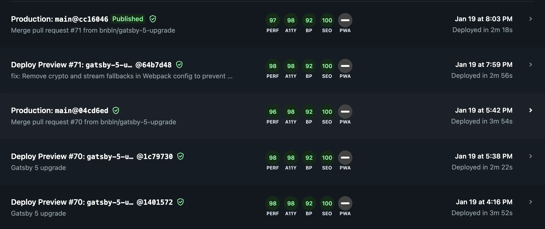
The result brings brand identity, responsive UI, and content management together in a website the firm can maintain over time.
Check it out here: rechtsklarheit.de
A further redesign is in progress in 2026. The new visual identity explores the idea of transparency in the name Rechtsklarheit, with corresponding updates to the website’s UI.